Trip Doodler
Dashboard redesign focused on clarity and accessibility.
Empathize
This is the project where I’ve learned the most, simply because it was my first hand-on experience and here is where I conducted my first research steps, that included making surveys and interviewing users in order to gather information.
Survey
Based on results of the survey I’ve realized that participants were traveling more than once per year and were sustainably aware so that means that they were portraying the right type of user of future travel planning tool.
Interviews
After gathering information from survey, I then conducted interviews with few potential users in order to find out (among other things):
- what kind of sustainable parameters would user find useful when planning a travel;
- what kind of interface would be appealing and easy to use when planning a travel;
Findings from interviews
Define
Creating Personas
Then I defined a target group profile to better empathize with my main user.
Ideate
My next step was analyzing competitors and exploring possible solutions. After gathering enough information, I began to sketch ideas, define task flows and creating rough, low-fidelity prototypes.
Prototyping and Testing
With low-fidelity paper prototypes my ideas could be easily tested in usability tests and without much effort, adjustments could then be made. I’ve tested my first design ideas on few users and made some adjustments:
-
I’ve rearranged the columns of text when the user would read about some destination;
-
made clear whose travel pictures are included once the user is reading about the certain destination;
-
came up with the idea of including pictures of friends/other users of the app with whom are users connected in order to build personal connection between users and their travels that are shared online;
-
implemented an idea of ranking travel destinations by date/recency (for instance “latest travels”) rather than just by popularity.
Then it was time for creating in Figma. This is the step in which I enjoy the most, since there I can visualize all of the findings that I’ve gathered in previous phases, and then create interface that will be “molded” by user needs, in order to help them in reaching a goal by using a certain product.
After a while mid- and high-fidelity prototypes were made. These prototypes were clickable so users could test them once more by clicking through the app. Again, user tests revealed small vulnerabilities in the structure of the user interface, which led to further improvements.
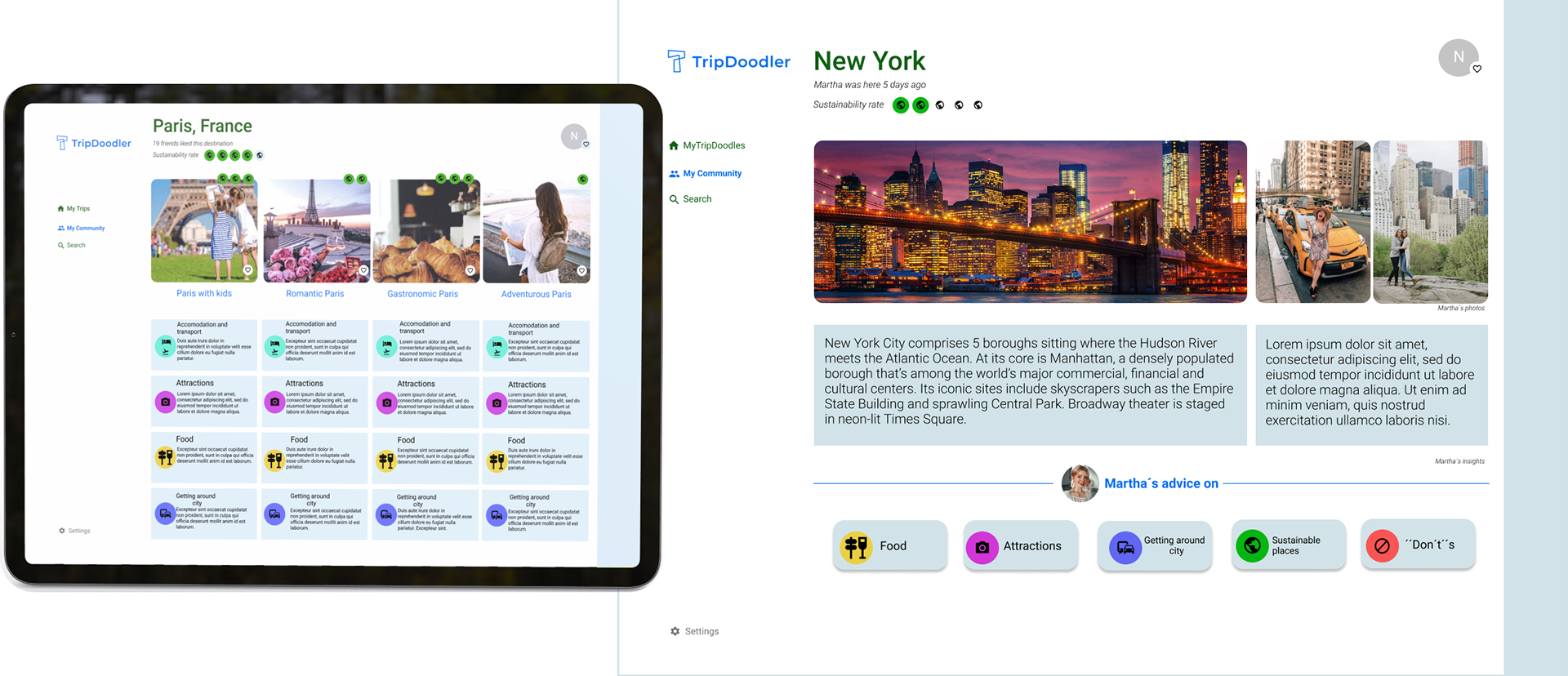
Final solution
If there was more time available…
-
I would work on the research more, as this is an extensive topic with many factors included (for example, ratings of hotels, restaurants based on sustainability);
-
Further iterations and tests with even more participants included.
Learnings
1. Big challenges require small steps
It may doesn’t seem like this project was a big challenge, but sure it was big - to me.
This was my first “real” project where I could implement all of the principles, theories and learnings that I’ve been reading about prior to it and also to learn so much on the way.
This is why I sometimes felt overwhelmed by the whole project and then I realized- I have to take small steps, which will gradually lead me to the solution.
And they did. It is a wonderful tactic that I’m taking with me for every future project, for sure.
2. Be open to research and let ideas go
When I first started working on a project, I knew that the research phase is essential in order to figure out an optimal design solution but I also knew that one of the next phases is designing and I just couldn’t wait.
This is the “artistry part” and I love anything that is creative, so I just wanted to finish the research as soon as possible. Once I finished conducting interviews I was hooked.
Hooked on the facts and insights I’ve gathered without even knowing that it’s possible to get so many useful inputs when talking with potential users. And there I realized that I should always highly appreciate the research and trust it completely.
Also, based on research all of the future design ideas should be built, rather than “just my own ideas of nice design”, because I’ve realized that too- after redesigning and adjusting the design to the users needs.