GuideIT
Dashboard redesign focused on clarity and accessibility.
Empathize
The project began with a meeting between two non-profit tech schools called ReDi and Hack Your Future that offer IT courses to people with refugee background. My team and I focused on understanding the root problem in order to discover a successful solution. We did this through communicating with the people with refugee background and understanding their needs and unique situation. What are their assumptions and needs, how do they use existing websites/apps, and what are they ultimately wanting to accomplish?
Interviews & Surveys
My teammates and me once were newcomers in foreign country too, so we knew exactly were to find participants for quantitative and qualitative research. Online communities, such as Slack groups that gather newcomers that are seeking tech education were our main spots for sharing our online survey, and later finding participants for interviews. We formulated questions for an online survey that was answered by 50 people and based on the those findings we formulated list of interview questions that later had given us a clear understanding of the problem we were attempting to solve. During this phase we also understood how challenging this project will be, given that all of the phases will have to be conducted online, due to the COVID-19 pandemic. (This had been challenging for sure, but also gave me the chance to learn how to work with the team and manage a big project while working from home.)
Findings from interviews & surveys
Define
Creating Personas
Using the quantitative and qualitative data from interviews and survey results, we defined two user profiles, to better empathize with our main user groups and prioritize goals according to their needs.
Ideate
Researching the market, analyzing competitors and exploring possible solutions were next steps that we took. With enough information gathered, we begin sketching ideas, defining task flows and creating rough prototypes.
(This is the part where I personally felt most comfortable and especially enjoyed working. Here I was using information gathered in previous steps of the process and “transformed” them into sketches and later prototypes. I’ve had an idea of including some kind of robot into app, which would give identity and a personal touch to the app.)
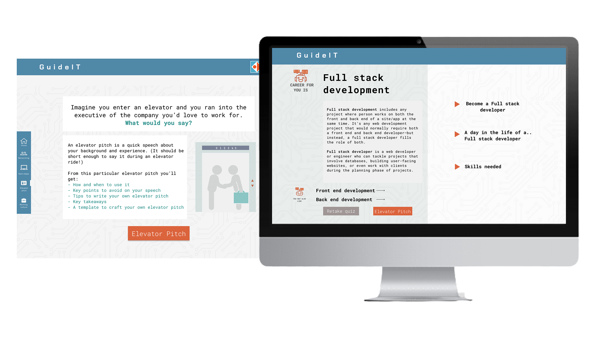
Prototype
After exploring potential ideas and structuring the wireframes we began the process of visual UI design of the hi-fidelity screens. This included defining the initial elements that will be used to create the overall design system. The logic behind chosen color palette was to somehow include colors that were dominant in both of the schools-our clients. Those colors were orange (for ReDI school) and dark blue (for Hack Your Future school).
User flow
While working on user flow, we have had many iterations and corrections in a first part of the flow:
- Should the Sign In and Sign Up pages be included?- this is where we first felt like it’s too early to think about personalized profile page for the user since the app is in it’s “early days” of development. So we then left this idea aside and only in the end of the whole designing process, after we had consultations with developers, we designed and included them.
- How many questions our Quiz should have?- We weren’t sure how many and which questions to include in this type of a quiz, where the results should indicate which segment of IT industry is right for the user (if any). This is the part of the project on which we definitely spent a lot of time, researching online and finding inspiration in personality tests in order to formulate and choose question. High-fidelity prototype- Final solution
Test
Throughout the entire design process, we had communication with two UX teachers from the tech school that initiated this project, showing them wireframes, sketches and rough prototypes for validation. We also wanted to make sure that the app we created was functional and covered all the necessary workflows, so we tested it on 6 different people who were asked to go through several tasks that would allow them to experience the whole app. After that, redesigns and adjustments were made accordingly.
Hand-Off, Collaborate, Assist
Once the design was final and had been approved, we’ve been working with engineers at the beginning of the development process. We wanted to make sure the developers are clear on the design, interactions and overall flow. The design iterations were made multiple times here, too.
If there was more time available…
- More research in general, but especially in the quiz part where the logic behind questions and results based on them is very complex. This extensive topic with many factors included definitely requires more time and resources.
- Further iterations/ test phases
Learnings
-
“If you want to go fast, go alone. If you want to go far, go together.”
- As a designer who is at the beginning of his career, this project meant a lot to me, to learn about the ux and ui design, and to get a real “hands-on-experience”, but most importantly to realize the power of teamwork. The teamwork was extra challenging due to remote working caused by pandemics, and also by the fact that I was new to the team, but this is where I feel I´ve learned the most.
-
Be ready to let ideas go.
- I made the classic mistake that many of the junior designers make-I´ve got attached to my design. When you´ve spent weeks putting your heart and soul into a design, it´s pretty tough to not get attached to it. And sometimes client just don´t see what you see in the initial design, and that is- fine. This is where I´ve learned that I should see my design as a solution to a problem, not as “something pretty”.
-
Journey Maps are my best friend
- Especially as it gets more complex, journey mapping is very helpful, on the one hand to put a comprehensive process on paper and to uncover problematic and promising points, on the other hand to provide a basis for good cooperation for all people involved.
-
Letting others to suggest changes is very helpful
- It happened few times that other people “accidentally through in” some suggestions which turned out to be were very useful, so this is where I´ve learned that letting others to suggest changes is also- fine.
-
Perfection is overrated
- Instead of using perfectionism as a tool for bringing out my best work, I end up using it as tool for escaping the failure. Truth is that everyone´s idea of perfection is different- and as such, there can be no logical way of achieving it. No matter how hard I´m working on details, there is always someone to toss a “what if…” my way. I can´t please everyone, so I should stop trying.